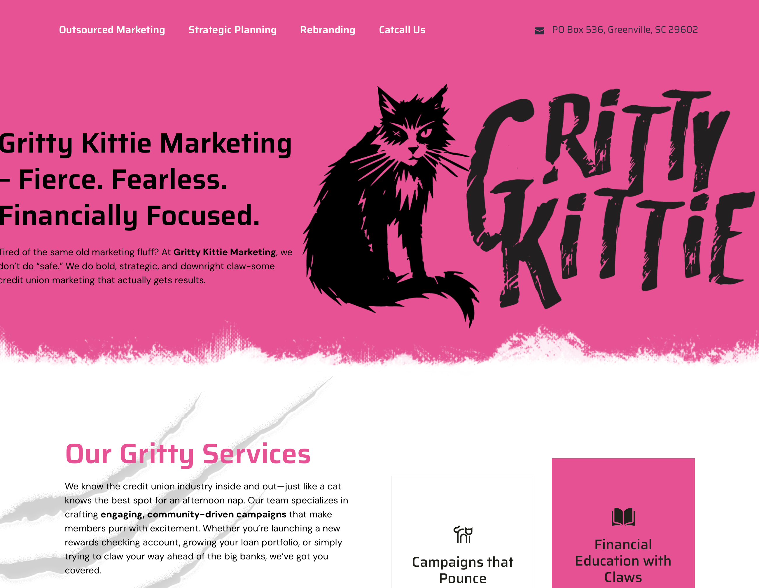
SOMEWHERE IN THE CLOUD–One company is appropriately today launching a rebranding as the “Gritty Kittie.”
In a statement, Your Marketing Co. explained the “credit union landscape is shifting, and survival means making tough calls.”
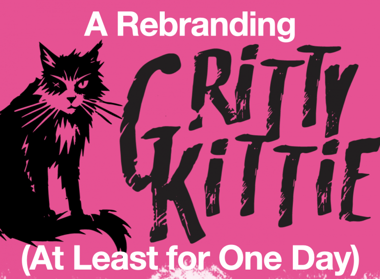
As a result, for this Tuesday at least it will be the Grittie Kittie, a name it said embodies the fierce, strategic approach required to keep small and mid-sized credit unions independent and thriving.
“Credit unions are being told that mergers are the only way forward. Gritty Kittie rejects that narrative,” the company said in more than a purr. “They believe credit unions can take decisive action through strategic marketing, branding, planning and transformative staff training.”
“However, if you are looking for safe, tired, we’re not the team for you,” added CEO Bo McDonald.
“We didn’t just change our name – we sharpened our claws. Credit unions don’t need another feel-good marketing firm. They need a partner ready to pounce on challenges, scratch outdated strategies, and fight for their independence. Gritty Kittie is that partner.”
Ed Feline?
While credit unions have a long history associated with Ed Filene, in this case the feline logo involving a “battle-worn cat with a missing eye is a symbol of resilience, scrappiness and the willingness to fight for survival,” according to Frank Allgood, vice president of brand experience.
The firm added that the bold, claw-marked pink screams confidence and defiance. “The rough-edge, hand-drawn lettering? It’s raw and unfiltered – just like the kind of leadership credit unions need to thrive in today’s marketplace,” it added.
More info can be found at: grittykittie.agency.